What color suits you best? Which is better to forget? – Briefly about color types
Written by Eszter Mengyán
When I started dealing with sustainable fashion in 2016, I also constantly examined my own wardrobe. For example, I was curious about the explanation for the fact that I don't like to wear certain clothes. It was then, after my adolescence, that I became interested again in color type analysis, during which our natural endowments are taken as a basis, and the goal is to create color harmony between the clothing and its wearer.
First, I went for a color consultation to find out which shades look really good and which ones I should forget forever. I liked the counseling process so much and I was able to relate it to sustainability so well that I decided to learn this method myself. After a lot of practice, I have also been working as a color consultant since the fall of 2018. Since the beginning, my communication has improved a lot, and my vision has improved a lot, but my enthusiasm has not changed. All in all, I consider the color type analysis to be a good self-knowledge tool, and it really helps us to buy or select clothes more consciously, create a capsule wardrobe, and make our dressing more sustainable.
When Zita (Zita Majoros, the founder and designer of Printa) asked me to tell about the color types on the Printa blog and to help her choose some shades for the new collection, I gladly said yes.
We are diverse, different shades look good on us
But what is all this color typology - you may legitimately ask anyway. It is enough to walk down the street or get on a bus, and it is already striking how diverse we are. That the eyes of brown-eyed people are not uniformly brown: golden brown, dark chocolate, amber, decorated with green dots, but some say they have puddle-colored eyes. Blue can also be grayish, greenish, bright blue, which darkens when you are angry or sad. Your skin can also be peachy, pink, yellowish, golden or even bronzed. Not to mention the range of hair colors. That is why it is impossible that the same shades look good on everyone.
If we only take the yellow: there will be those for whom mustard yellow suits their natural features best, while others will look pale in the same shade, but lemon ice cream yellow looks perfect on them. For some, the orange sun yellow looks beautiful, for others, the UV yellow known from the techno parties of the nineties will be fantastic (no matter how scary this shade may seem at first).
The four big color types and their properties
The classic system of color consulting classifies us into four major types according to our natural abilities. These types were named after the seasons, but they could also have been named after the letters of the alphabet. The point is not their name, but what qualities we associate with them.
Cold and bright shades, such as royal blue, fuchsia, burgundy, look good on winter types. Winter types usually have brilliantly bright or dark eyes that harmonize beautifully with saturated colors. They are the ones who can wear quite dark, solid colors, and black officially suits them best.
If someone belongs to the summer type, they still look beautiful in cold shades, but while winters can wear bright colors boldly, summers are usually overwhelmed by these saturated shades. They don't have such bright eyes, so the ashy, softer shades, often referred to as pastels, highlight their beauty. As a summer type, I find that dark colors are also less beneficial, rather medium dark or lighter shades make me fresher.
Spring types can look amazingly different, and it is not so easy to recognize them at first. They have brightly colored eyes, so they don't have to be afraid of wearing bright colors either. However, their skin becomes really radiant with warm shades. Just so you understand: warm orange-red, coral are much better suited to spring types, such as dark burgundy or blood red. Too dark colors don't suit them either, but lighter, vibrant shades do.
The name of the autumn color type has the most to do with the color palette. They look fantastic in the colors of the autumn forest. Warm, broken colors go well with them, terracotta, brown, mustard yellow or khaki look great on them. They can wear quite dark shades, but black is not the most ideal for them either.

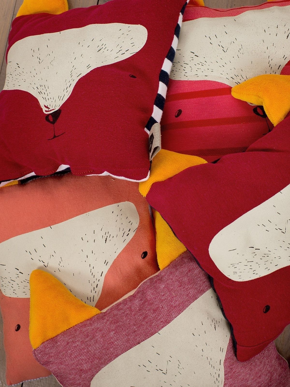
Top row: spring, winter
Bottom row: autumn, summer
Criticism of color advice
Although I think color consulting is a fantastic tool, I understand exactly why many people consider it outdated and sometimes looked down upon in design circles. The color type system is a kind of harmony among many, which quite rigidly excludes, for example, the use of cold-warm or bright-broken colors next to each other in the 1.0 interpretation.
For example, the warm khaki shade doesn't officially look good on me near my face, but I like to wear it as a skirt, i.e. away from my face. And on top I wear a cool shade from my own color palette.
Nevertheless, I see that it can help a lot for those who are not yet confident in the world of colors or clothing, but would like to consciously buy from domestic brands, creators, and designers. During counseling, I regularly say that this system should not be interpreted as a set in stone rule, since colors are only a part of our clothing. We also communicate with colors, which is why it doesn't matter what shade we wear in different life situations.
Those who have consulted with me are also looking for colorful pieces by Hungarian brands and designers, but this does not mean that the designer must serve this system 100% and give up his own principles or creative freedom. However, getting to know the color types and incorporating certain elements can be exciting.
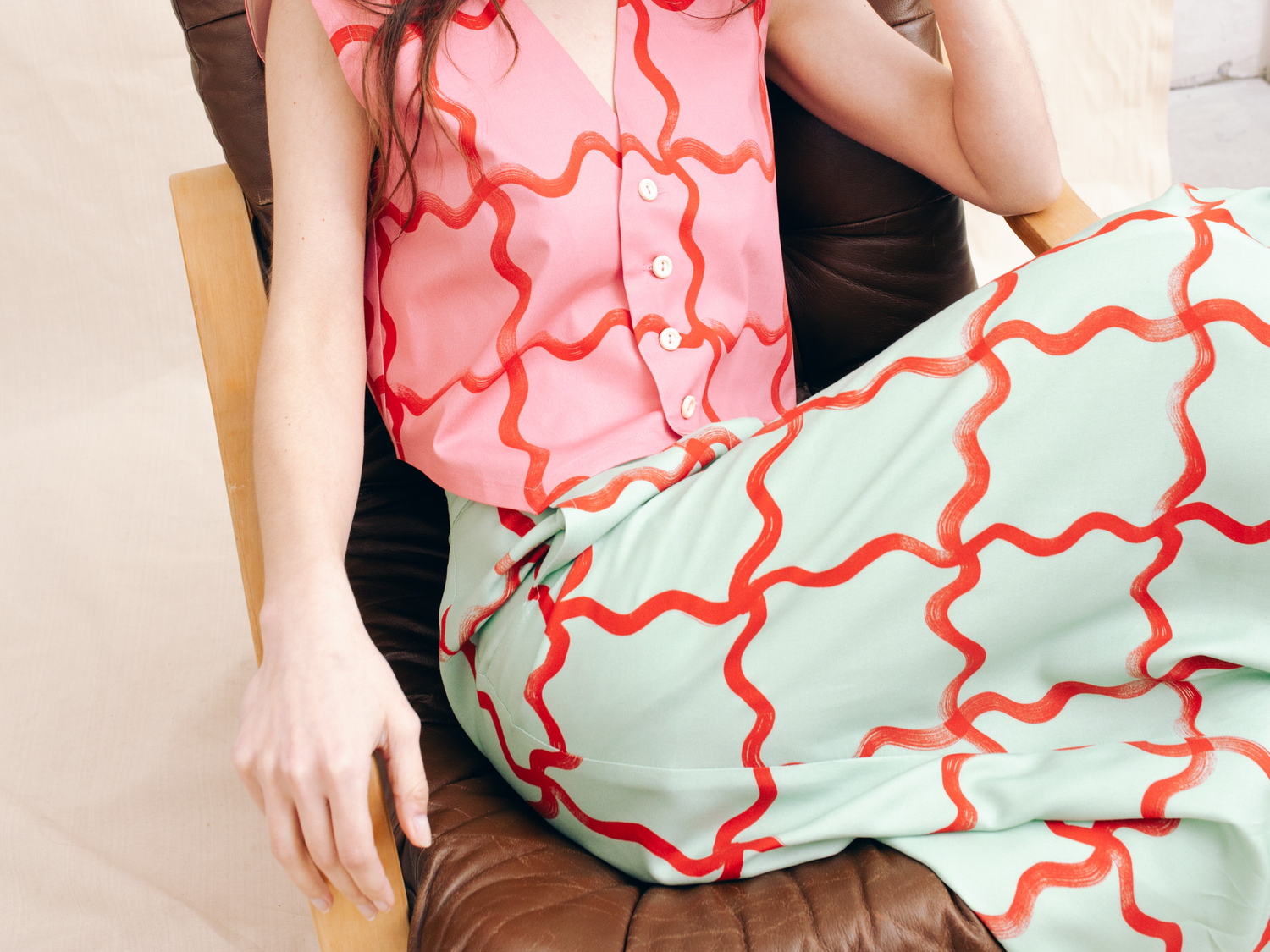
When Zita asked for my professional advice regarding the colors of the new Printa collection, she aimed for this. I think he found the golden mean: he kept the natural color scheme of Printa, but was also happy to rely on my experiences and insights. This is how the 2021 spring collection became more colorful, yet very printed.
It was an honor and a great experience to be a part of.

